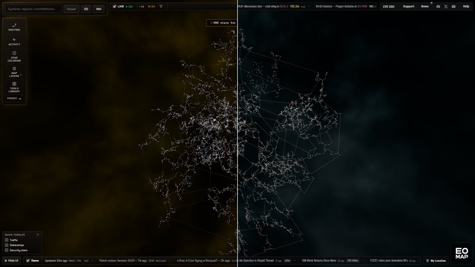
I was watching a stream recently where somebody linked EO-Map to someone else. He clicked it, looked at it for about two seconds, and his first reaction was basically, "this looks like it's from 2012."
That stung.
In my defence, EO-Map was originally dragged across from my other map (the first post on this blog has that story), and I am very much not a UI designer. I've just been bolting things onto it over time and trying to stop it looking completely terrible. But after hearing that I figured, fair enough, let's actually sit down and see if I can make it look a bit more modern. It isn't the first time a stream has changed the map either. Watching Erst raid skyhooks is how it got region names in the first place.
The look
The tickers are staying. I know scrolling tickers are probably old enough to have a mortgage at this point, but they're an absurdly efficient way of getting a lot of live information into almost no screen space. They did get some attention. Kills are coloured by value, the edges fade instead of being cut off, and when nothing is happening the kill ticker now says something like "Quiet, last kill 1m ago" instead of sitting there looking broken.
A lot of the rest has had a pass. The top controls are now much more unified instead of looking like a collection of little boxes, tabs have been flattened out, and some of the general chrome has been tidied up. The old 2D button told you what it would switch to rather than what you were looking at, which is backwards once you think about it. It's now one 3D and 2D control that shows which one you're in, with a small lock beside it in 2D.
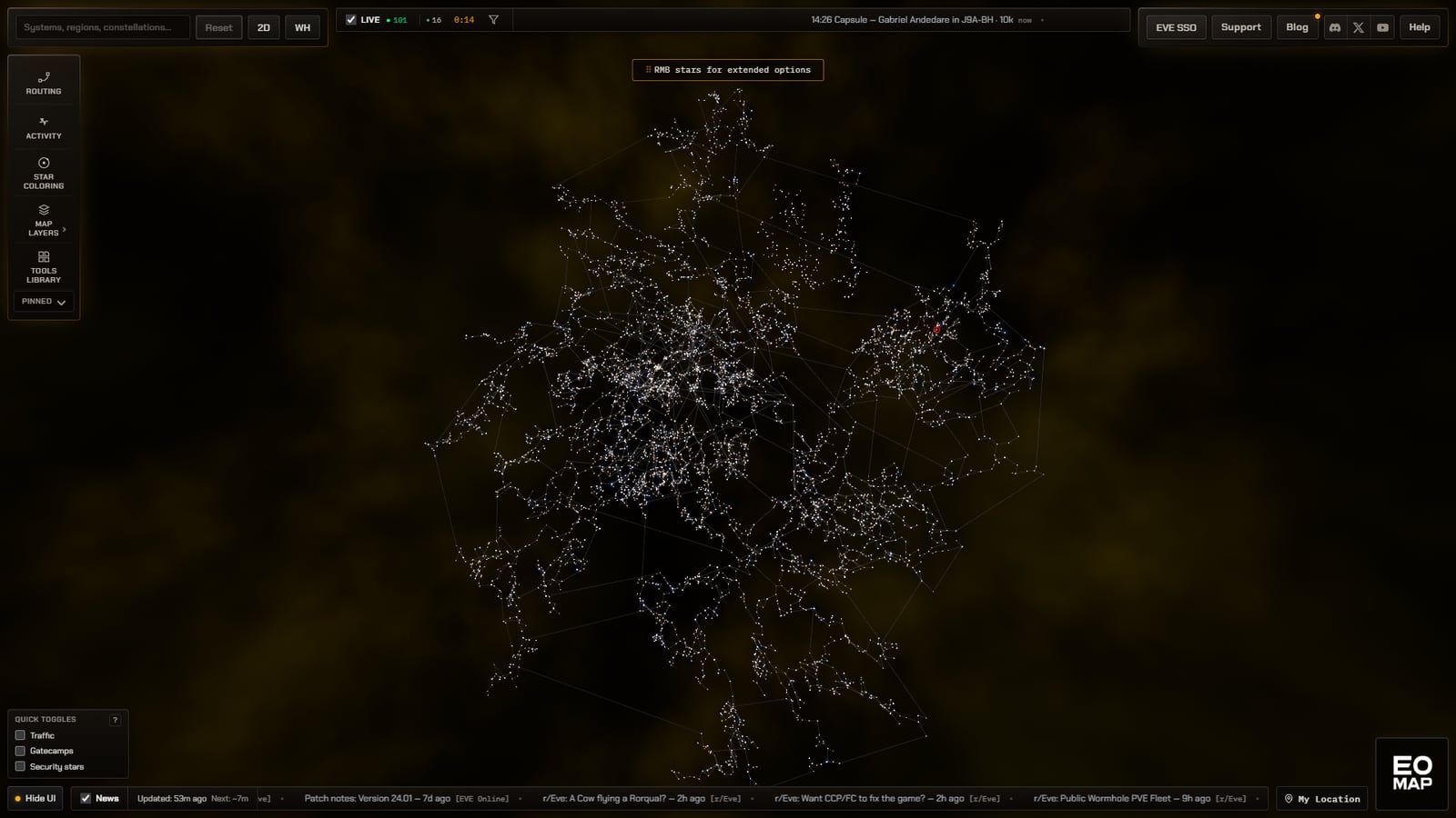
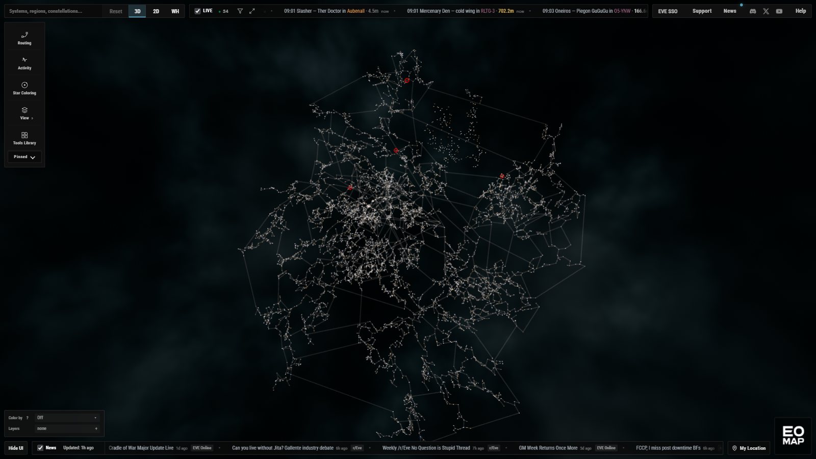
There's also a new theme called Cryo, which is now the default. Cryo leans fairly heavily on EVE Online's UI for inspiration. The font isn't EVE's actual font, but it has a similar feel, the colours are derived from the client, and the windows have the same sort of active and inactive transparency idea. You can independently tune window transparency, extra transparency when inactive, and background blur in Display Settings, so if my defaults offend you there are three sliders waiting to be blamed instead.
And yes, I've forced the new theme onto everybody once. Ember was the default before, it's the orange one on the left above. That may prove to be an unpopular decision. If you hate it, Orange, Blue, Green and Ember are still there and only a couple of clicks away, and they've had some of the same cleanup, so even going back should look a bit less 2012.
At 1440p the UI is now basically trying to retreat to the very edges of the screen and pretend it isn't there. That's fairly deliberate. I've always maintained that the map should be the star of the show, so if I can keep all the controls and information I want while reducing the amount of screen they occupy, that feels like the right direction.
The bit that surprised me
This is the part I actually wanted to write about. While I was doing all of that I was taking still screenshots and putting them into an LLM, asking what else needed adjusting. Fix what it flagged, send the next screenshot, repeat. For a while the critique was mostly about the browser chrome. Then, once the chrome was mostly sorted, it moved on to the map itself.
The first view was the one in the before and after above. The whole of New Eden in 3D, all 8,089 systems, zoomed out to fit, nothing switched on. To me that made sense. It's a pretty universe, it's the whole map, there you go, that's what you've come for. It's what my other map has opened on for over a year and I never questioned it.
The LLM's view was that if that's what people see when they first load, they'll probably click away. It wasn't quite that harsh, but close enough. And I'll be honest, a two second review on a stream is roughly the same verdict.
What a new visitor sees now
So what it proposed, and what a first-time visitor now gets, is this. The map opens centred on Jita, zoomed in on The Forge and the regions around it, out to about Placid, Pure Blind, Metropolis and Sinq Laison. It's the 2D map rather than 3D, locked to north up. The combat layer is on with the last 24 hours of kills, region names are on, and Jita is selected with a small label saying it's a trade hub, so there's at least one familiar name to anchor on. The Layers list is open in the bottom left so you can see that Combat is on and turn it off if you don't want it. It closes as soon as you click the map.
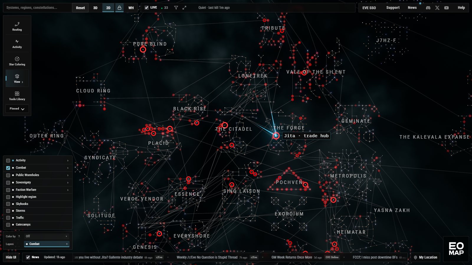
On a first visit it actually starts in 3D, framed on the same area, and then a second or so after the map and the kills have loaded it flattens itself into 2D using the same transition as the 2D button. Any click, scroll or key press skips straight to the end, and if your system is set to reduce motion it doesn't animate at all. My thinking, and I could be wrong, is that it hints the 3D map is still there underneath without asking a brand new visitor to make sense of it first. It's one click away on the 3D button.
On a phone it's the same idea with a tighter box, just The Forge and the regions next to it, and it isn't locked, because the phone layout has no unlock button and I didn't want to trap anyone in it.
| What you see on a first visit | Before | Now |
|---|---|---|
| Theme | Ember | Cryo |
| Layout | 3D | 2D, north up |
| Framing | All of New Eden | The Forge and its neighbours |
| Selected system | None | Jita |
| Layers on | None | Combat, last 24 hours |
| Region names | Off | On |
If you've used EO-Map before, you won't get any of this. You'll get the map the way it has always opened, and from now on it remembers where you left it, per browser, so a refresh puts you back where you were instead of back at the start. If you use My Location with EVE SSO, it now remembers that too and finds your character again when you reload, instead of making you click it after every refresh. That one was a bug.
Tool at rest, tool in use
The way I've come to think about it is this. Before, I was presenting EO-Map as a tool at rest, ready to be used. Now it's presented as a tool in use, with a lot of visual things happening at once. I think that's good. Whether it causes confusion, I don't know. There's a lot on screen in that first view. Red rings over a dense tangle of gates, a dozen region names, a list of layers, two scrolling tickers. Someone who has never played might find that a lot. Someone who has will probably recognise Jita and The Forge straight away, which the old view never gave them.
So whether the LLM is right or not, I don't know. It's a language model looking at a screenshot, not a new player looking at a map, and I'm aware I've just redesigned the first impression of my map on the say-so of one stream viewer and one chatbot. But the old first impression had its two second review and it wasn't a good one, so I'm happy to try something different and see.
The one thing I was worried about was load time, because a first visit now pulls in a day of combat data before the map settles. I tested it with the browser throttled to roughly a mid range laptop and a phone, cold cache, combat switched on both times. It came out about the same, give or take the noise between runs. Not fast, but not worse.
| Throttled profile | Combat rings drawn, before | Combat rings drawn, now |
|---|---|---|
| Laptop, 4x CPU slowdown, 20 Mbps | 6.0 to 6.5 s | 5.6 to 7.4 s |
| Phone, 6x CPU slowdown, 9 Mbps | 10.2 to 13.1 s | 9.0 to 10.6 s |
A few smaller things went in at the same time. Region names now look more like territory names on a paper map, bigger, lighter and spaced out, so you can tell them from system names at a glance. System names sit beside their star instead of on top of it, so the combat rings don't cut through them. Labels that would end up under the top bar or off the edge of the screen get hidden or nudged back in. And the News button now tells you whether it's the blog or State of New Eden that has something new, rather than just showing a dot.
If you've got an opinion on the new first view, good or bad, let me know. I'd rather hear it from a person than from a chatbot. Anyway, apparently random comments on streams are now part of my design process.