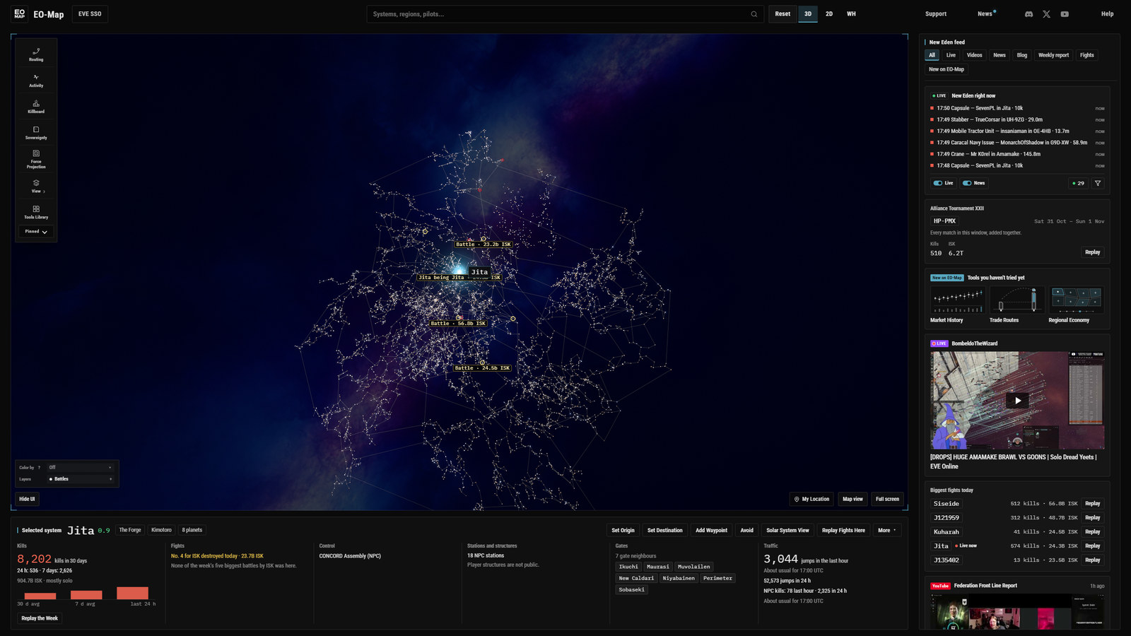
I built this layout for my other map a week ago, and I wrote about it there. The short version of why is that I made the mistake of watching YouTube on my 32 inch 1440p monitor without going full screen, and it all just worked. The video in a box, the comments and the next videos around it. Then I opened my map on the same monitor and it was a huge amount of empty space with a search bar across the top. So I built the YouTube layout for the map. This is the EVE Online version of it, on EO-Map, and I think it is the better of the two because EVE Online has more going on to put in the feed.
If you are on a big monitor, open EO-Map and press T. That is the whole pitch. The rest of this post is what it is, where the data comes from, what the news curator costs me and what it took to build, because I find that last part interesting even if you do not.
What Watch view is
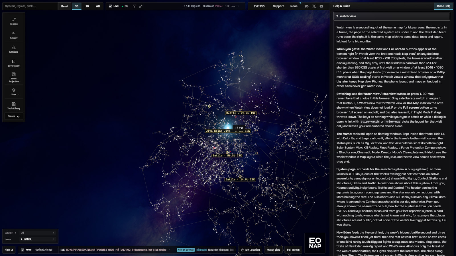
It is a second layout of the same map. Same stars, same layers, same tools, same windows. The map goes into a frame with a 64 pixel bar across the top, the page for whichever system you have selected sits under the map, and a feed runs down the right-hand side. Your tools still open as floating windows, they just stay inside the frame now.
There is one button at the bottom right of the map that says Watch view, or Map view once you are in it, and a Full screen button beside it. T switches, F does full screen. The choice is remembered in your browser, so if you pick Watch view you get it next time. The buttons appear on any desktop browser window of at least 1280 by 720 CSS pixels and stay until the window drops under 1200 by 680. If your window is at least 2048 by 1080 when the map loads, which is a maximised browser on a 1440p monitor at 100 percent scaling, your first visit starts in Watch view. After that it is whatever you chose. Phones and embedded maps never get it.
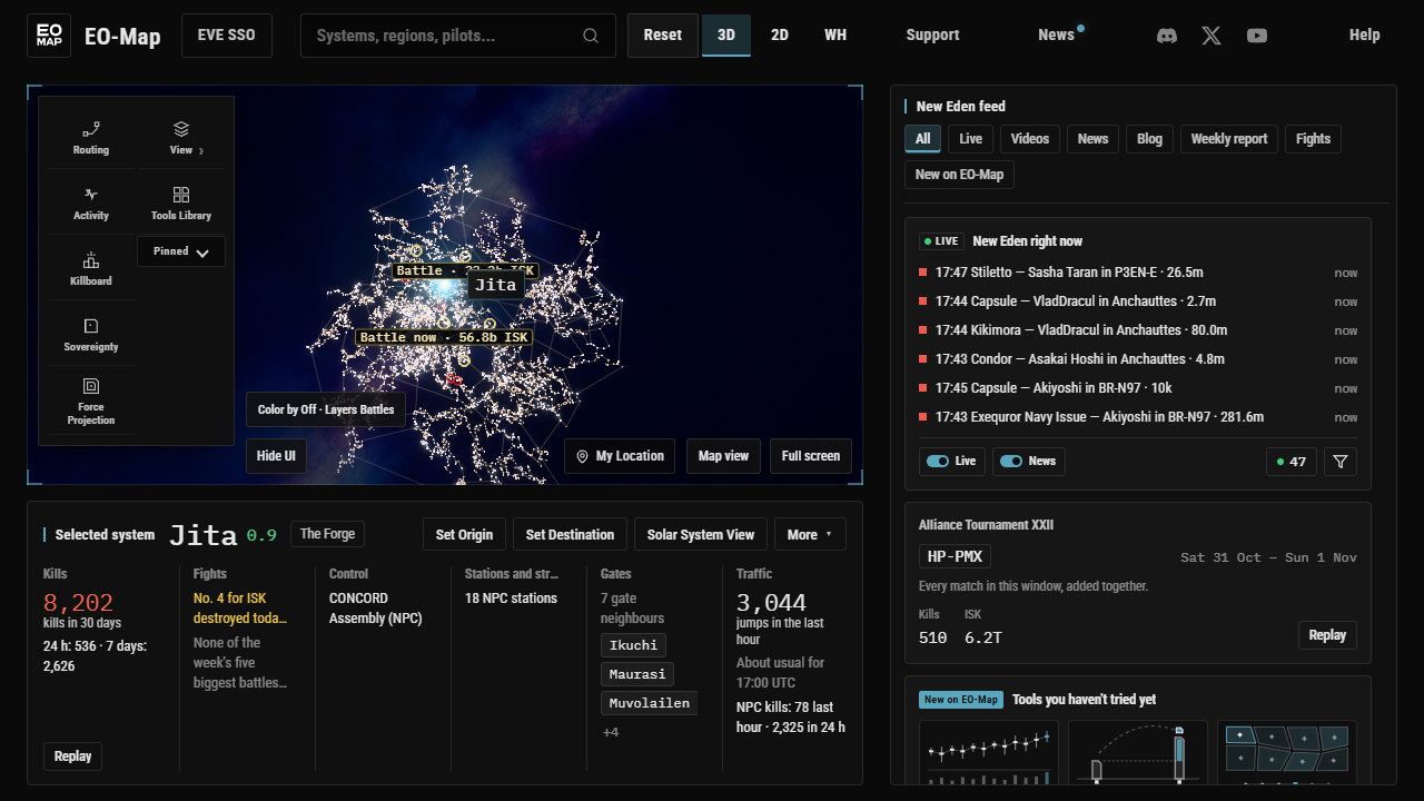
One thing I got wrong in my own head during the build. I assumed a 1440p monitor at 125 percent Windows scaling would still get the default. It does not. At 125 percent the browser window is 2048 wide but only about 1,030 tall once the taskbar and the browser's own bars are taken off, and the rule needs 1080. You still get the buttons, you just have to press one. I have left it like that for now because the rule is about the window actually having room, not about what the monitor is called.
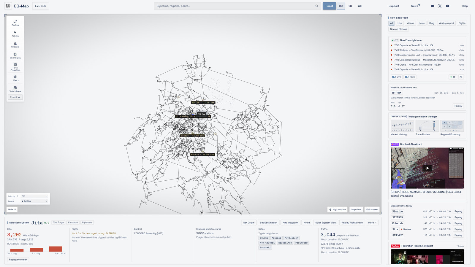
Why not just redesign the map
Because people have the map set up the way they like it and I did not want to move anything. So the rule for the whole build was that Map view has to stay pixel identical. Not similar. Identical. Every phase of the build ended with a headless comparison of nine screenshots of Map view against a baseline I took before touching anything, and the only pixels allowed to differ were a masked status row that shows the time. That ran after every change and it caught things, which is the point. Early on a rail transition and a status pill were drifting by a few pixels and I would not have seen either by eye.
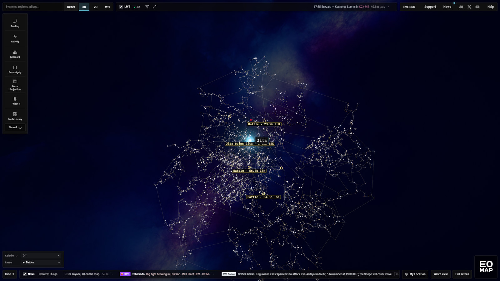
The other reason is that I do not know what the right layout is for everyone. I know what I wanted on a 32 inch screen. Someone on a 24 inch 1080p screen wants the map and nothing else, and that is what they still get.
The system page
Select a system and the page under the map fills with six cards. The header has the system name and security, the region and constellation, your recent systems as chips, and the same actions the star menu gives you: set origin, set destination, add a waypoint, avoid, solar system view, replay the fights here. On a narrow window some of those fold into a More menu. In Russian and Ukrainian they fold sooner because the verbs are longer, which I spent more time on than I expected.
Which six cards you get depends on whether the system is busy. Busy means five or more killmails in the last 30 days, one of the week's five biggest battles there, an active sovereignty campaign or an incursion. A busy system gets Kills, Fights, Control, Stations and structures, Gates and Traffic. A quiet one gets About this system, From you, Nearest activity, Neighbours, Traffic and Control, because if nothing happened there the useful thing to know is what the system is and where the nearest thing that did happen is.


The rule I cared about most is that no card is allowed to look empty or to make something up. If a card has nothing to show it says what is not known and why. Player structures are not public, so the Stations card says that rather than showing zero. If the Killboard file has not loaded yet the Fights card shows a loading line rather than saying there were no fights, which it did for about a tenth of a second in an early version and a reviewer caught it. That sounds like a small thing. It is not, because a sentence that says no fights happened here is a claim, and for a tenth of a second it was false.
The New Eden feed, and where it comes from
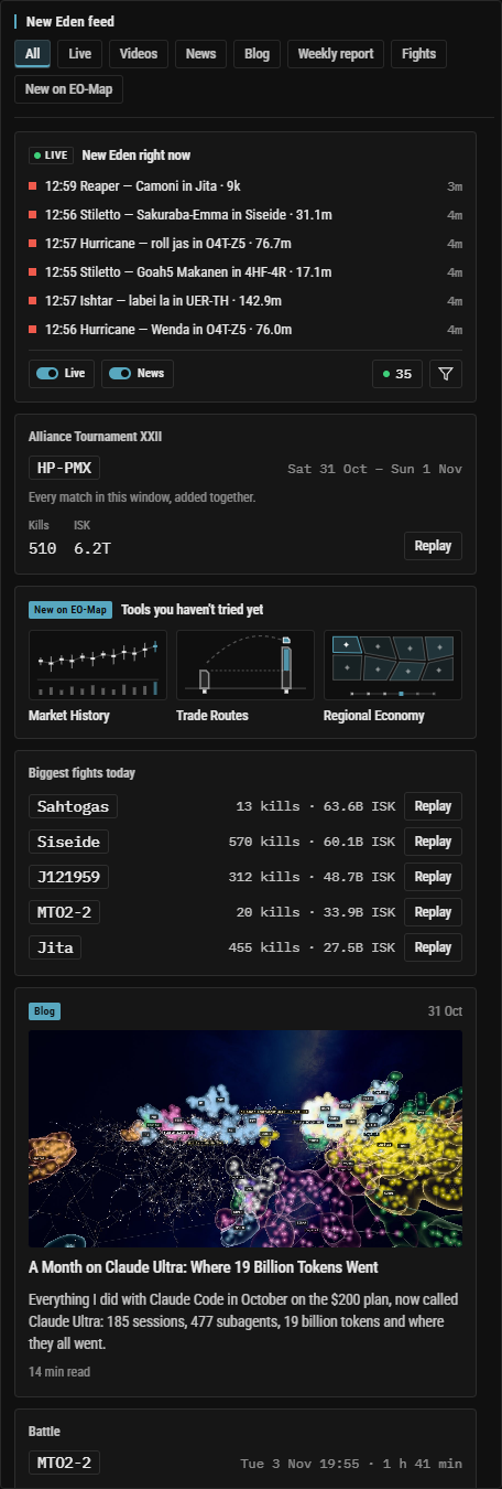
The feed is the part that makes the layout worth having. Each kind of card has one adapter and one source, and the whole thing reads EO-Map's own snapshots on EO-Map's schedule. Nothing in the feed asks an upstream API from your browser. The only live part is the live card at the top, which is the same event stream the ticker shows in Map view, six rows that never move the cards under them.
| Feed card | Where it comes from | How fresh |
|---|---|---|
| Live events | The live kill socket, the same one as the Map view ticker | Live, six rows |
| Biggest fights today | The Combat snapshot and the Killboard file | The Killboard file is rebuilt every 10 minutes; the card needs a Combat snapshot under 6 hours old |
| News and videos | The curated news snapshot from my collector | The collector polls its sources every 10 minutes and the editor rewrites at most every 15 |
| Blog | The blog's own posts list | When I publish |
| Weekly report | State of New Eden's issue list | Thursdays |
| New on EO-Map | The Tools Library catalog | When I ship something |
| Tools you haven't tried | Your own browser's list of what you have opened | Three tiles, rotated daily |
The chips along the top filter it: All, Live, Videos, News, Blog, Weekly report, Fights, New on EO-Map. On All the live card comes first, the week's biggest battle second and three tools you have not opened yet third, then everything else newest first, mixed so that two cards of one kind rarely sit together. The feed re-checks its sources every 10 minutes while it is on screen and stops asking when the tab is hidden. The tickers are not shown in Watch view, so their controls moved onto the live card: the Live and News switches, Stats, the filter menu and the Live Events explorer. Clicking a row in the live card selects that system, which I use more than I thought I would.
The news curator
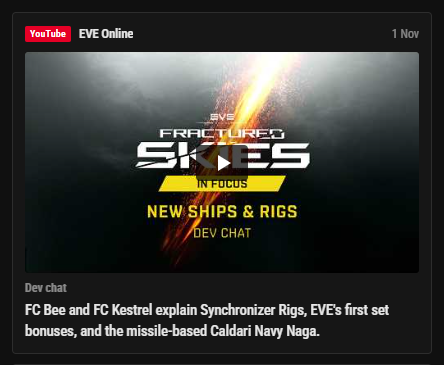
The news cards are written by Claude, running inside my collector on the VPS, and this is the part I want to be careful describing. It has been curating the ticker since October. What is new is a feed edition published beside the ticker lines: the same curated pool, with a picture and a short summary per item.
The rules it works under are the ones I ported from the other map, and a reviewer went through every one of them to check they actually fire. A summary can only contain numbers that appear in the source. No relative time words, because a summary written once and shown for days cannot say recently. No stock phrases. No Reddit usernames. Translations are checked against the English for number drift. Pictures come only from the source's own image host, a list of seven hosts that is identical on the collector and in your browser, so there is no way for a crafted link to put an image on the page. Reddit posts only reach the feed when the editor already picked them for the ticker, and a Reddit picture is only used after a small Haiku model has looked at it and said it is safe and on topic, and only if Reddit declares it at least 320 pixels wide. Each summary is written once per item and cached, so a busy day does not mean a busy bill.
That bill is the thing I watch. The whole collector has a cap of 3 dollars a day in code, with 1 dollar of that reserved for the ticker so the feed can never starve it. A reviewer ran one full dry run with real token counts and it cost 25 cents for 21 calls. A typical day projects at 39 to 57 cents, a busy day at about 1 dollar 20, and a month at 12 to 17 dollars. If the cap were hit every single day the worst month is 90 dollars. Both maps share a 200 dollar monthly API credit and EO-Map's share of that is 100, so it fits with room.
| What | Cadence or cost |
|---|---|
| Source polling | Every 10 minutes |
| Ticker rewrite | At most every 15 minutes, only when the pool changed |
| A summary with its six translations | About 1.7 cents, once per item |
| A full run in the dry run | 25 cents, 21 calls |
| Typical day | 39 to 57 cents |
| Busy day | About 1 dollar 20 |
| Month | 12 to 17 dollars |
| Cap | 3 dollars a day, 1 reserved for the ticker |
The collector with the feed edition went live on the VPS on the Thursday afternoon, after the review and a labelled backup of the database, and published its first edition a quarter of an hour later: 30 entries, 24 of them with a picture, for 17 cents. One side effect I should mention: the Twitch source now shows the top four live EVE Online streams rather than only the official channel, in the ticker as well as the feed. I had the credentials on the box already and I chose to keep it that way.
What it took to build, and why it took longer than the original
I did this the way I do everything now. One long brief, an orchestrating agent, Opus agents building each phase in their own worktrees, and a different Opus agent attacking each phase before the next one started. That is the same shape as the EF-Map build the week before, and I expected the port to be the quicker of the two, because this time the agent had finished code to copy from and a page of porting notes it had written for itself. It was not quicker. It was roughly two and a half times the work, and that surprised me enough that I went through the logs afterwards to get numbers rather than a feeling.
Both columns below come from the same place, the session logs, tallied the same way. The EF-Map ones are from that article. The EO-Map ones are a floor, the same caveat the other article gave, because a few of the earliest helper agents left no transcript behind. The cost is what the same tokens would be at the API list prices. I pay the subscription, not that.
| Measure | EF-Map, built from scratch | EO-Map, ported |
|---|---|---|
| Wall clock, first prompt to closeout | 20 h 07 m | 52 h 00 m, about 13 h of it a power cut and a weekly usage limit |
| Time with at least one agent working | 14.1 h | 37.6 h |
| Summed agent working time | 21.5 h, of which 3.6 h orchestrator | 61.7 h, of which 28.0 h orchestrator |
| Subagents | 33, 23 Opus and 10 Sonnet | 28, 23 Opus and 5 Sonnet |
| Tool calls | 5,219 | 6,140 |
| Tokens | 1.44 billion, 98 percent cache reads | 4.17 billion, 98.5 percent cache reads |
| API-equivalent cost | $513 | about $1,490, of which Opus $1,073, Fable $418, Sonnet $3 |
| Adversarial reviews | 6 | 7, each with a re-check, five followed by a further fix pass |
| Commits | 76 | 55 |
| Files changed | 286, 21,125 lines added and 681 removed | 359, 29,650 added and 602 removed |
| New test files | 42 | 58 |
| New strings | 186, in each of seven languages | 241, in each of seven languages |
The first thing the numbers say is that the tool calls are nearly the same, 5,219 against 6,140, but the tokens are nearly three times. So each step the agents took carried about two and a half times as much context, roughly 670 thousand tokens per call here against about 270 thousand on EF-Map. I think that is most of the story, and it comes from how the work was cut rather than from the models. On EO-Map the agents were fewer and lived longer. The Phase 3 builder ran for about five hours and 718 turns, the Phase 2 shell builder for 1,165 turns, and every reviewer re-ran the whole gate set itself, 14,000 tests, both production builds and the pixel harness, with all of that output sitting in its context while it carried on working. EF-Map used 33 shorter agents, ten of them Sonnet doing lookups and screenshots, and got through the same number of steps on a third of the tokens. Same orchestrator, same models, same rules. Different cut. The orchestrator itself was also far busier here, 28 hours of turns against under 4, mostly writing the ledger and waiting on reviews, which is where the Fable share of the bill comes from, if the two tallies measure that the same way.
The second thing is that porting into a fork that has drifted for three months is not copying. EO-Map's ticker, live events code and stores had all moved on since August, and there is no Worker on this map, so the news curator had to be re-homed inside the collector on the VPS with a database migration and a deploy, where EF-Map's already lived in a Worker with a key value store. The diff here is 40 percent bigger than the original's, and 241 strings against 186. Some of that is the collector. Some of it is that every piece the agent lifted from EF-Map had to be re-fitted to EO-Map's data and then tested as if it were new, because as far as the tests were concerned it was.
The third is the reviews, which I asked for and would ask for again. Seven adversarial reviews, each with a re-check of the fixes, found 6 blockers, 17 majors and about 85 minors, and all but a handful of the minors were fixed before the phase closed. The reviewers were briefed to go further than EF-Map's. One took fresh screenshots of main and the branch and diffed them without the masks rather than trusting them, and another loaded the page with every data source held back for twelve seconds to see whether any card claimed nothing had happened before it knew. They found things. The blockers ranged from a Watch view that failed to load and left the map drawn at the wrong size, through a divider drag that quietly rewrote a saved panel height, to two sentences on the privacy page that had become untrue and a timing gap where the collector could have fetched from Reddit in the same minute as my other map's curator on the same server. The last major was a sentence on the system page that was plainly false for busy systems, and that is exactly the kind of thing I cannot find myself.
And the last is the dull one. The machine lost power on the Wednesday afternoon and I ran into my weekly usage limit at four in the morning on the Thursday, which between them cost about 13 hours of wall clock and, when the agents resumed, a re-read of everything they had been holding. They picked up where they stopped both times, which I am still a bit surprised by, but it was not free.
So the port cost about three times the original in compute for a result I think is the better of the two, and the lesson I am taking is about how to cut the work rather than whether to review it. Shorter agents with narrower briefs, gate output summarised instead of pasted into the context, and more of the lookups on Sonnet. I will know on the next one whether that is right.
I am not a coder. I have said that in every one of these posts. What I am is the person who decides what the thing should do and who reads the reviews. The agents are better at this than I would be if I spent a year learning, and the reviews are better than I would be at reviewing, and the combination ships things I could not have shipped alone. I think that is worth saying plainly because people still ask.
What is next
The layout will show up in What's new on the day it goes to production. There is a design pass sitting in my inbox with suggestions for below 1600 pixels wide, where the map pane gets small because the feed and the page are fixed sizes, and I will probably take some of those. The news feed edition needs a few days of real traffic before I trust the cost numbers over a month rather than a dry run.
If you are on a big monitor, have a look and tell me what feels wrong. Most of the changes to the other map's version came from exactly that kind of feedback, and I expect the same here.